Lemonade is a transformative digital platform designed to foster connection, joy, and community through coaching, podcasts, and journaling. With a dual-audience model—coaches and individuals seeking coaching—the app needed to balance professional tools with accessible, fun, and welcoming interactions. My task was to create a design system that brought the brand values of connection, transformation, and fun into a functional, user-centred interface.
Design Goals
Reflect Brand Values: Translate the playbook’s cheerful, transformative tone into UI elements.
Balance Dual Audiences: Ensure pathways for coaches and clients are clear but not siloed.
Simplify Navigation: Create an intuitive, app-like flow with clear entry points.
Encourage Engagement: Use bright visuals, prompts, and lightweight gamification to spark joy.
|one|
Research & Alignment
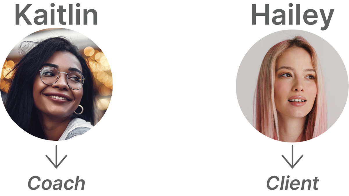
The first step was to ground the design process in a strong understanding of Lemonade’s strategic foundation. I reviewed the brand playbook and extracted key values such as connection, compassion, and transformation, while also mapping these to user needs. To deepen this alignment, I developed user journeys for both coaches and clients, charting the steps from onboarding through discovery to long-term engagement. This exercise revealed that while both groups were motivated by connection, coaches valued professional exposure while clients sought safety and authenticity. Establishing these journeys early on gave me a blueprint for later design decisions.
|two|
Information Architecture
Once the user journeys were established, I focused on structuring the platform in a way that felt natural to both audiences. To do this, I conducted card sorting sessions to test how potential users grouped and labelled features like “Community,” “Support,” “Classes,” and “Resources.” The insights validated a simplified navigation model centred on a home dashboard, groups, and a supporting menu drawer. Organizing the information architecture in this way allowed users to begin with simple, inviting tasks—like exploring podcasts or communities—and gradually uncover deeper functionality such as mentoring, journaling, and resource libraries.
|three|
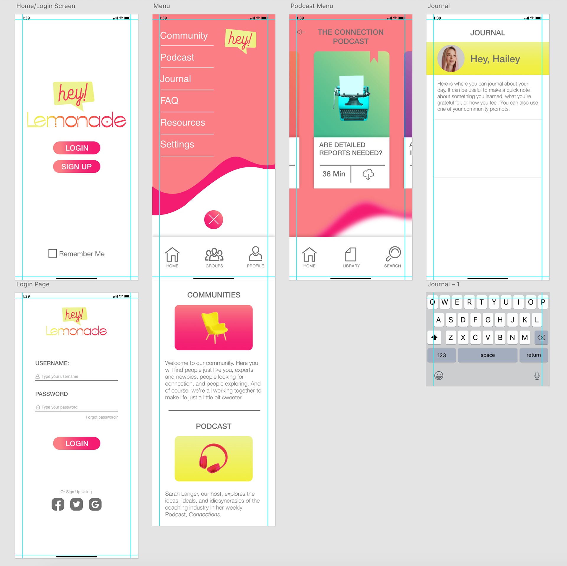
Wireframing and Early Mockups
With a clearer structure in place, I translated the journeys and architecture into wireframes and early mockups. The initial screens covered essential flows such as login, profile setup, menu navigation, and journaling. At this stage, I observed points of friction: icons felt inconsistent, hierarchy was unclear, and pathways between journaling and community features were buried. Mapping these issues back to the user journeys revealed where engagement might break down, reinforcing the importance of maintaining clarity and consistency across modules. These insights informed the refinement of layout and interaction patterns.
|four|
Refined UI Design
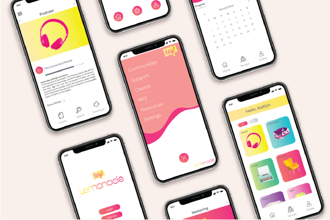
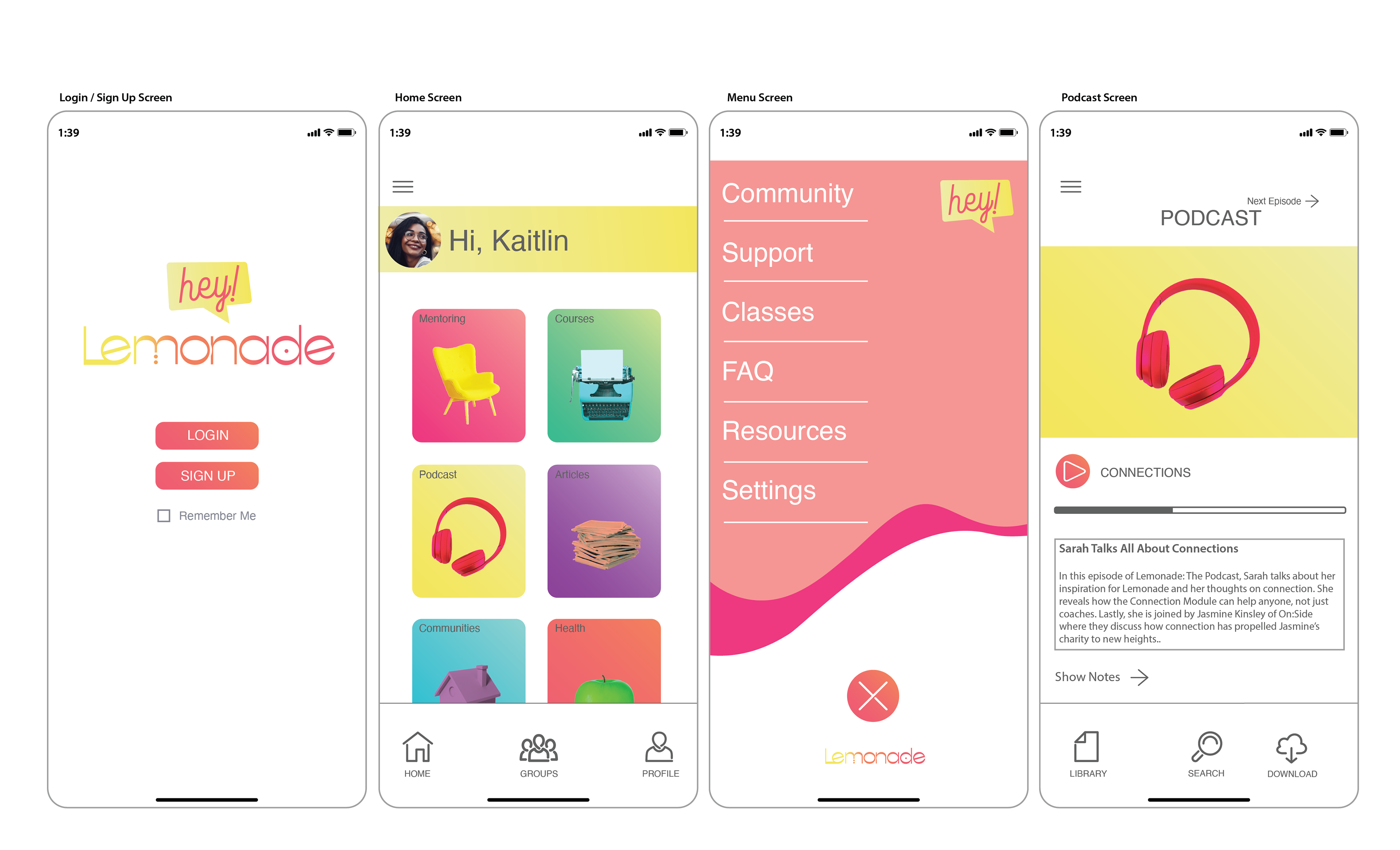
The final stage was to infuse the interface with Lemonade’s personality while resolving usability gaps. I introduced a modular card system on the home screen that featured Mentoring, Courses, Podcasts, Communities, and Health as distinct but visually related entry points. The menu was redesigned with clearer typography and more generous whitespace, improving scan-ability. The podcast experience was enhanced with larger header images, progress indicators, and contextual notes, while journaling screens were personalized with friendly greetings like “Hey, Hailey” to reinforce belonging. These refinements tied usability directly to the brand promise, creating an experience that was joyful, transformative, and easy to navigate.
Outcomes
The design evolution strengthened both brand coherence and usability. Clearer user journeys improved discoverability and reduced friction, while card sorting ensured the navigation structure matched user expectations. Personalized greetings, bright gradients, and modular cards made the platform feel inviting and vibrant. As a result, Hey Lemonade became not just a tool, but a community—an experience that embodied transformation, acceptance, and joy.